Ever wonder why U.S. debt just keeps growing? Our interactive chart shows the debt climbing from the 1700s to today and even updates as you watch. It’s a lot like watching a train get longer or a balloon inflate, it gives you a clear look at how the numbers are stacking up. Let's take a closer look at the ups and downs over the years and see what these changes might mean for our economy.
Understanding the U.S. Debt Graph: Historical and Real-Time Snapshot
This interactive chart shows the nation’s debt from 1790 to 2025. A live tracker updates the amount in real time: as of September 12, 2025, the debt stands at $37,470,833,295,098.68. Think of it like a scoreboard that keeps changing or even like a train slowly adding more cars as it moves along. You can also picture it like a balloon that keeps growing with each puff, each one adding a bit more to the total.
The chart is set up simply. The X-axis marks the years from 1790 to 2025, while the Y-axis shows the total debt in U.S. dollars. This layout makes it easy for anyone to see both the long-term growth and the latest borrowing figures at a glance. The numbers come from trusted sources like the U.S. Treasury Department and the Congressional Budget Office, so you know the information is current and respected.
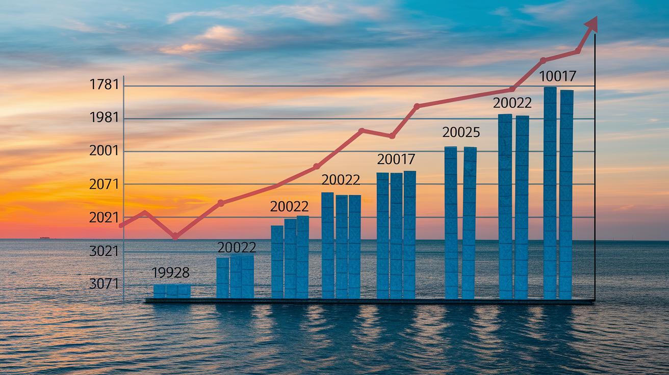
Key data points mark some important moments in debt history. For instance, the U.S. debt hit $1 trillion in 1981, jumped to $10 trillion in 2008, reached $20 trillion in 2017, and climbed to $30 trillion by 2022. The latest figure, almost $37.5 trillion, shows that the upward trend in borrowing has been steady over the past two hundred years.
| Year | Total Debt |
|---|---|
| 1981 | $1 trillion |
| 2008 | $10 trillion |
| 2017 | $20 trillion |
| 2022 | $30 trillion |
| 2025 | $37,470,833,295,098.68 |
U.S. Debt Evolution Chart: Milestones and Turning Points

After World War II, the country slowly built up its debt while investing in rebuilding efforts and laying the groundwork for a brighter future. The rise in debt was steady, reflecting recovery plans and new public projects meant to help everyone get back on track.
In the 1980s, things changed quite a bit. Tax cuts and higher spending on defense meant the government had to borrow a lot more money. In fact, between 1945 and 1980, the overall debt grew by about 600%. It’s clear that policy shifts can really make a big impact.
Then came the 2008 financial crisis. When the economy slipped into recession, big stimulus packages were put in place to keep markets stable. That move caused the national debt to jump roughly 125% over the next ten years, highlighting how urgent measures can lead to significant changes.
More recently, during the COVID-19 crisis, borrowing reached record levels. The government’s fast response to fund essential health measures and support economic recovery pushed the debt even higher, showing how emergencies require bold actions.
Here's a quick timeline:
| Year | Event |
|---|---|
| 1981 | Debt spiked due to aggressive defense spending and tax policy changes |
| 2008 | The financial crisis led to large-scale stimulus efforts and a significant rise in debt |
| 2010 | Debt jumped noticeably as recovery measures continued |
| 2020 | Record borrowing to support massive COVID-19 relief spending |
| 2022 | Ongoing economic support kept borrowing rates high |
Projecting Future Trends with Your U.S. Debt Graph

Experts have taken projections from the CBO and added a forecast line to our debt graph to cover 2025 through 2035. They worked by averaging recent growth rates and adjusting for the natural ups and downs in the economy. Think of it like updating your timeline with clues from the past to help foresee how government borrowing might unfold. This approach smooths out short-term bumps so you can see the bigger picture.
Looking ahead, it seems the U.S. debt could climb to roughly $45 trillion by 2035. The debt-to-GDP ratio is expected to rise from about 125% in 2025 to around 140% by 2035. These estimates come from tracking current trends and predicting how spending might shift over the next ten years. Here’s a quick look at the key figures:
| Year | Total Debt (approx.) |
|---|---|
| 2025 | $37.5 trillion |
| 2030 | $41 trillion |
| 2035 | $45 trillion |
In addition, recent legislative moves like the megabill are projected to add about $3.4 trillion in deficits over the next decade. This policy change is set to affect government borrowing and could shape how the long-term fiscal picture looks.
Analyzing U.S. Debt-to-GDP Ratio in Your U.S. Debt Graph

The debt-to-GDP ratio is a simple way to compare the country’s total government debt with the money it makes in a year. Think of it like comparing a family’s mortgage with its yearly income. This graph shows a line that follows this ratio from 1960 to 2025, making trends easy to see.
Watching this ratio can tell you a lot about government choices and the state of the economy. When the ratio is high, it may mean the government is borrowing more than the economy can easily handle, which could lead to higher borrowing costs or stricter fiscal rules. For example, in 2020, this ratio peaked at about 106%, meaning for every dollar the economy produced, there was roughly a dollar of debt. Check out the table below for the top five years when the debt levels were especially high:
| Year | Debt-to-GDP Ratio |
|---|---|
| 2020 | 106% |
| 2021 | 102% |
| 2022 | 101% |
| 2019 | 100% |
| 2018 | 98% |
When the debt-to-GDP ratio goes above 100%, it means the country's debt is more than what it produces in a year. This can change how investors feel and might push policymakers to find ways to reduce borrowing so that the nation stays on a solid financial path.
Tools for Customizing Your U.S. Debt Graph

When you want to build a debt graph just the way you like it, several platforms make it easy to see your data clearly. They let you play with interactive charts, export your data in different ways, set friendly time ranges, and even add notes or embed the charts on your website. This means you can watch government borrowing trends in a way that fits your style.
Here are a few options:
| Tool | Key Feature |
|---|---|
| TreasuryDirect visualization portal | Simple data exports and easy chart tweaks |
| Federal Reserve FRED | Custom time ranges for different needs |
| DebtData.gov | Built-in options for annotations and embedding |
| Private chart-builder services | Free API access to live data for your dashboards |
Choosing the right tool depends on what you need and how comfortable you are with data. Think of it like planning a road trip: if you want lots of flexibility and different types of information, go for a platform with robust export and customization features. But if you prefer a simple, easy-to-use experience, one of the free API services might be just what you need.
Final Words
In the action, we examined the us debt graph from historical milestones to real-time insights. The content broke down debt growth history, explained the timeline and impact of key legislative moves, and compared debt levels with GDP changes. We also highlighted tools that bring clarity through interactive charts and customizable options. All this insight equips readers to make informed financial decisions, lift their financial confidence, and plan for long-term financial security. The outlook is positive, offering clear perspectives for smart investing and personal finance management.
FAQ
Q: What does the historical U.S. debt graph show?
A: The historical U.S. debt graph shows how national debt has evolved from the early 1900s to today. It highlights key milestones and trends, offering a clear timeline of debt growth over the years.
Q: What does the U.S. debt clock display?
A: The U.S. debt clock displays the current, real-time national debt figure. It updates continuously to reflect the immediate scale of government borrowing as it happens.
Q: What does the U.S. debt Graph 2025 indicate?
A: The U.S. debt Graph 2025 indicates projected and current estimates for national debt in 2025. It uses historical trends and recent data to signal potential future fiscal challenges.
Q: What does the U.S. debt-to-GDP ratio represent?
A: The U.S. debt-to-GDP ratio represents the size of national debt compared to the nation’s economic output. It helps gauge the economy’s ability to manage and repay its debt.
Q: Is debt increasing in the U.S.?
A: The data shows that U.S. debt is increasing steadily, with the graph displaying rising figures over time. This trend is often linked to periods of significant government spending and economic stimulus.
Q: Who owns most U.S. debt?
A: Most U.S. debt is owned by a mix of domestic and foreign investors, including government agencies, financial institutions, and individual investors who purchase Treasury bonds.
Q: When was the last time the USA was debt free?
A: The USA has not been debt free since its early history, having accumulated debt to finance government activities almost since its founding. Recent decades show continuous borrowing.
Q: What does U.S. debt to China mean?
A: U.S. debt to China refers to the portion of national debt held by China through U.S. Treasury bonds. It reflects China’s investment in U.S. financial instruments and economic ties.
Q: Which country currently has the highest debt?
A: Determining the country with the highest debt varies by measure. In nominal terms, large economies often lead, while percentage-of-GDP comparisons may highlight smaller nations with high relative debt levels.