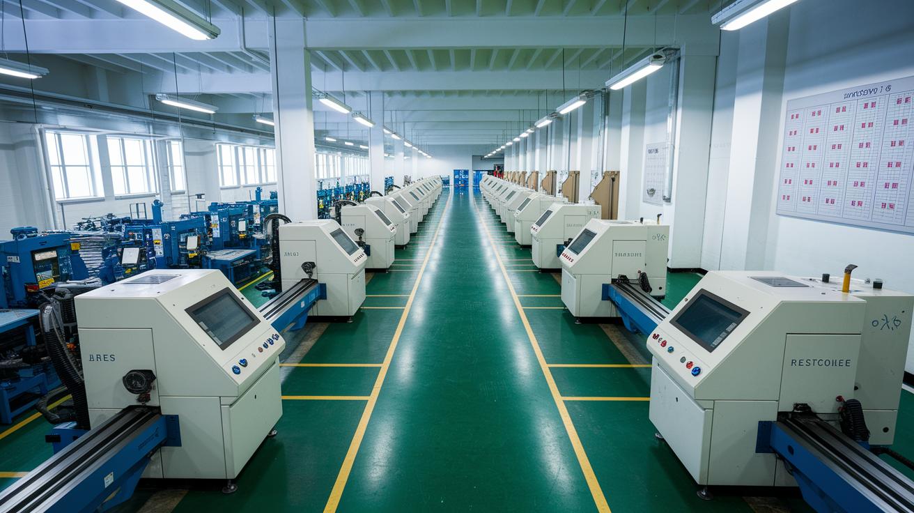
Have you ever wondered how a small bakery and a big factory both help create what you see on the shelves? Each one adds its own piece to the overall picture of supply. Think of it like a band where every instrument, small or large, plays a part in the music.
This big picture is known as the market supply curve. It shows how much everyone produces as prices go up or down. In simple words, it helps us understand where goods come from and gives us clues about economic trends. This insight can guide everyday choices, whether you’re planning a budget or just curious about how the market works.
Market Supply Curve: Clear Economic Insight

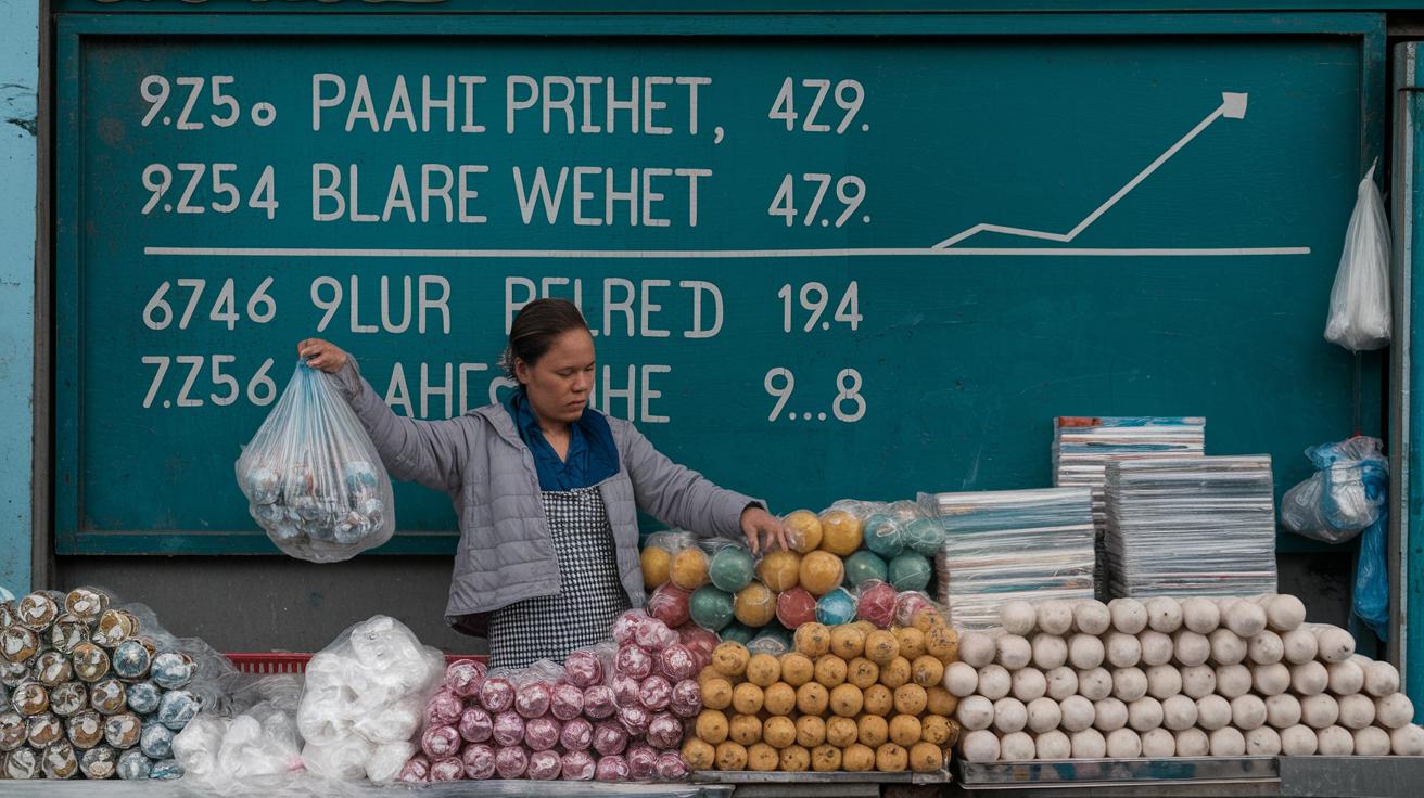
The market supply curve shows the total amount of a good that all firms in a market make. Think of it like gathering outputs from many small businesses into one big basket. Every business adds its own piece to the overall product supply. For example, if several local bakeries are all making loaves of bread, the combined result is the total supply of bread you see in the market.
When we look at market supply, we see how each business’s production decisions add up. This idea helps us understand how the total output changes as prices move up or down. It’s much like watching different parts of a well-organized orchestra come together. Each firm’s contribution matters, especially when prices change, giving clear clues for economic research and business planning.
If more producers join the market, the total supply usually goes up. Picture a new bakery opening in town; its extra loaves shift the supply curve, so there’s more bread available at every price. Recent studies updated with economic insights as of June 6, 2025 show that while more players in the market might lower the individual share of gains, they make more goods available overall.
This fresh perspective makes it easier for anyone studying market trends to see the bigger picture. Ever noticed how more choices on a store shelf can make a day feel full of options? That’s exactly what happens in a competitive market.
Graphical Representation of the Market Supply Curve

Imagine a simple graph where the price sits on the vertical line and the number of items (quantity) goes on the horizontal line. The very first point, where both price and quantity are zero, marks the beginning. When the price goes up, suppliers feel more motivated to produce extra goods. In other words, higher prices mean a bigger reward for making more, which is why the supply curve goes upward. This clear picture helps us connect the dots between price changes and how many items are made available.
Now, think about a supplier who sells 100 units for US$5 each. You can see that as a point on the graph at (100, 5). Then, if that supplier is willing to offer 200 units when the price rises to US$10 per unit, you get another point at (200, 10). Drawing a line through these points, whether it's perfectly straight or has a slight curve, shows the simple idea that higher prices lead to higher production. This neat diagram makes it easier for anyone, whether they are new to the topic or a seasoned market observer, to see how changes in price push suppliers to produce more goods.
Movement Along vs. Shifts in the Market Supply Curve

When we talk about movement along the supply curve, it means that a change in price directly affects how much producers are willing to supply. In contrast, a shift in the supply curve happens when outside factors, like new technology or changes in regulations, affect the entire supply without any change in the current price.
Here’s a quick breakdown:
- Movement Along: Price changes lead to different quantities being supplied while the supply function stays the same.
- Rightward Shift: Good external news, such as better technology, means more supply is available at every price.
- Leftward Shift: Bad news, like tougher regulations, causes less supply at every price.
- Constant Price: Sometimes the supply shifts even though the price doesn’t change.
Understanding these ideas is really important for making smart economic decisions. When experts notice a movement along the curve, they know that the ups and downs are mainly due to changes in price. But if they see the whole curve moving, that tells them that something bigger is altering the market’s landscape. This clear difference helps everyone, from policymakers to investors, better predict what might happen next and plan accordingly.
Key Determinants Causing Supply Curve Shifts

External factors affect the market supply curve in clear, real ways. When these outside influences change, the whole curve moves, meaning that for each price level, the amount offered changes too. This insight is vital for business owners and policymakers who need to keep an eye on the market and plan production levels.
- Government Policies (like taxes and subsidies)
- Input-Cost Changes (such as raw materials and wages)
- Technological Advances (including automation and new processes)
- Natural or Unforeseen Events (think weather or power outages)
Each factor makes its mark in a unique way. For example, a new tax or a helpful subsidy can change a company's urge to produce goods. Rising costs for raw materials or wages might squeeze manufacturers, making it tougher to produce as much as usual. On the other hand, new technology could streamline operations, letting companies produce more efficiently. And then there are unexpected events like harsh weather or blackouts that might slow production for a bit, pushing the supply curve to the left. In short, seeing how all these elements combine is key to understanding overall market supply.
Short-Run and Long-Run Dynamics of Market Supply
In the short run, businesses can’t change everything immediately because at least one resource stays fixed. For example, a factory might have only a few machines, so it can’t quickly boost production. This makes the supply line steeper since companies are limited in how fast they can adjust.
Over time, though, companies can change every part of their operation. They can invest in new machines, hire more workers, or even leave the market if things go south. This freedom lets them match production more closely with market demand, resulting in a flatter, more responsive supply curve.
Each period has a different effect on supply. In the short run, fixed resources slow down responses to changes in demand or cost. But in the long run, firms can tweak everything to get things just right. It’s a gradual process that helps the economy find balance as conditions change.
Price Elasticity and Responsiveness of Supply
Price elasticity of supply tells us how much extra product is made when prices change. In easy terms, you figure it out by dividing the percentage change in the amount supplied by the percentage change in price. For example, if prices go up by 10% and suppliers boost their output by 15%, the elasticity comes out as 1.5. This simple calculation shows us how quick and strong producers are in adjusting their output when prices shift.
Interestingly, some folks have pointed out that a few suppliers might choose to sell more when prices drop to increase their overall revenue. This idea goes against the usual thought that higher prices always mean more output. It seems that market competition and the costs of producing goods can lead to different pricing choices. In truth, looking at these alternatives helps analysts get a clearer picture of market trends and better measure how responsive supply is.
Real-World Examples of the Market Supply Curve

Let’s look at real-life examples that show how supply curves work, using two familiar scenarios: concert tickets and art production. These cases make economic ideas feel more real.
Imagine you’re planning to go to a concert. When there are only a few tickets available for a very popular event, prices go up as fans compete to buy a seat. This is because the sellers, like promoters, know they can charge more when tickets are scarce. Now, if something unexpected happens, say the venue suddenly allows extra seats or the artist cancels, everything changes quickly. Ticket prices might drop or rise, and the original supply curve no longer fits. It’s kind of like that surprise moment when you’re at a show and find out extra tickets have just been added.
Now think about art. Artists often spend many hours on each piece. For example, an artist might work for 20 hours on one painting. That means every extra painting costs them more time and effort. This extra cost, which we call opportunity cost, makes the artist raise the price on each new piece. When material costs rise or long work hours add up, an artist will only create more work if the market price is high enough to cover those costs. In this way, the supply curve for art shifts as the artist adjusts prices based on the time and effort required.
Final Words
in the action, we explored the basics of the market supply curve and how individual outputs build the overall market picture. We walked through plotting the curve, the role of price changes, and what shifts mean when external factors come into play.
This discussion simplifies concepts like elasticity and supply shifts to help you feel more confident about your financial decisions. Embrace this market supply curve knowledge and move forward with a positive outlook on your financial future.